February 9, 2012
Part of the crushing blow to the middle class is the misinformation being lobbed out as good economic news. For example, inflation is increasing yet the average American worker pulls in $25,000 per year. You also have the civilian population ratio still at levels last seen three decades ago. It depends on how you look at the data and how much spin you can tolerate. Should we be jumping up and down for joy that many Americans are now getting low paying jobs with absolutely no long-term security? As we analyzed in a previous article, in the early 1980s some 60 percent of American workers had some sort of pension. Even if it was minimal, it was something. Today it is down to 20 percent and quickly evaporating lower. Since we have become a debt addicted nation, the fact that household debt has contracted many Americans are now actually “poorer” and definitely feel it. Consumption makes up a large portion of GDP so this is a potential problem with households facing a major contraction.
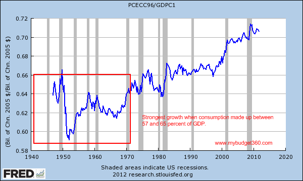
What is the ideal rate of consumption?
Economists always wrestle with the ideal amount of consumption for a society. Our goldilocks range seems to sit between 57 and 65 percent:
Some of the best growth years for middle class families came in the 1950s and 1960s. More people attended college without going into debilitating debt, jobs were plenty, and actual salaries were growing. The cost of items like housing was in line with incomes so people didn’t have to go massively into debt to finance their purchases. Yet that colossally changed and it looks like in the late 1990s is when we went into a consumption binge purely on debt. This brings us to the next chart of household debt.


No comments:
Post a Comment