July 10, 2013
How much do Americans earn? Such an important and pivotal question is rarely examined in the mainstream press. It almost appears to be a forbidden topic of discussion. You would think that this question would warrant deeper examination given that income is the driving force of our consumer hungry economy. Yet many people are driven to spend money they don’t have regardless of income because of the booming debt market. Household income growth is the critical issue when it comes to maintaining a vibrant middle class. You rarely get a straight answer when it comes to income growth because talking about incomes is taboo and actually is offensive in real life. Try asking someone how much they make at a party and find out how quickly unpopular you will become. Yet the data is frigid and cold but tells us many things about our economy. What Americans earn sheds a deeper perspective as to how well households are doing in the current economy. So how much do Americans earn at this stage in this so-called economic recovery?
US Household Income
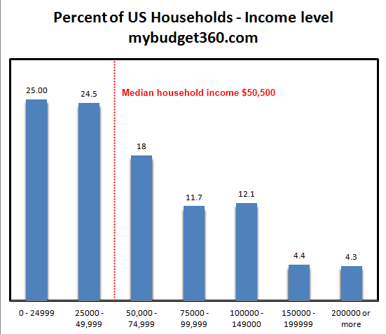
Source: Census, ACS
The best breakdown of income is from the US Census ACS data that breaks down household gross incomes. The above chart is fairly clear. The median household income in the US is $50,500 based on the latest data. Given that this is the perfect splitting point of 114 million households, you get a better idea of how the other half is living here.
What is fascinating when we dig into Social Security records is that the average per capita wage is $26,000 so this lines up nicely with the predominant two-income household trend we have been seeing over the last few decades. What I find intriguing however is that most regular television ads seem to cater to the idea that every family is making more than $100,000. If you look above, only about 20 percent of all US households make that much. This is why we are in the massive debt problem that we currently have. We as a nation and at a family level are spending way beyond our means simply by going into massive debt.
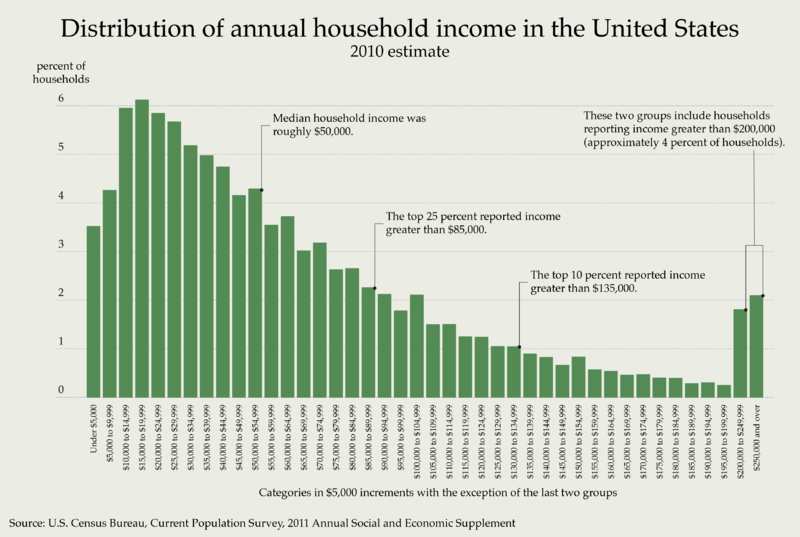
Looking at the income distribution in another light might be helpful:
Looked at from a different perspective, we realize how rare it is for households to make more than $100,000. I always find it fascinating when you have pundits come on TV and act as if $150,000 is middle class. Look at the raw data. Unless the definition of middle has changed, the middle is now $50,000. Instead of arguing that $150,000 is little, they should be discussing why income growth for most of the country has gone cold in the midst of a recovery. Also, we have over 47 million Americans on food stamps. These are the families at the other side of the income chart.
Real Income Growth
So what has happened to income growth over the last decade?
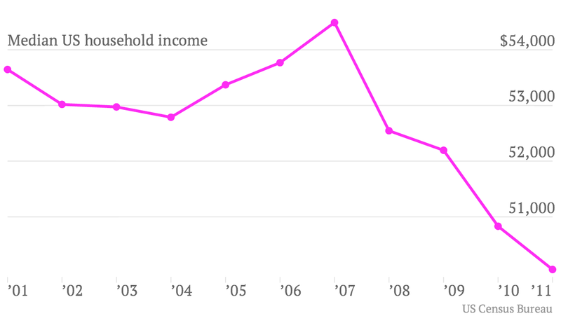
The real median US household income is now down to levels last seen in 1995. For most people, income growth has been virtually non-existent. In real terms, most families are in a financially tougher position than they were in the mid-1990s.
The peak above is somewhat deceptive however. In 2007, the peak was reached by a massive debt induced bubble and many tied to this bubble where making inflated wages (similar to the tech boom where simply putting up a website nearly entitled some to million dollar paydays).
Inflation is a sinister beast when it comes to income growth. If inflation is outpacing wage growth, we get what we are seeing in the charts above. Your purchasing power erodes and then people wonder why it costs so much to go to college, buy a car, or even a home.
When we adjust for inflation, we see that real income growth only occurred for a small portion of families:
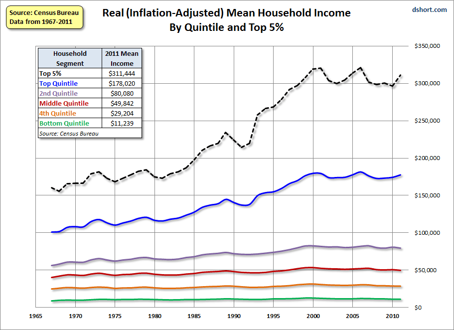
Over the last couple of decades, you would have to be in the top quintile of household incomes to see some true growth. The top five percent have done exceptionally well but that is only a tiny portion of our country.
Yet if you look at the other 80 percent of households, income growth has flat-lined.
If we break up income growth by age brackets, we also see that younger Americans have taken it particularly hard:
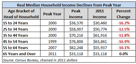
Source: Dshort
What the above chart doesn’t reflect is the amount of debt that is saddled on young Americans since the cost of going to college since 2000 has gone on a ridiculous bender. From 2000 to the present, total student debt went from $200 billion to over $1 trillion becoming the second largest consumer debt market only behind mortgage debt.
Economy and Income
So you might be asking how can Americans spend at these levels if incomes are back to 1995 levels:
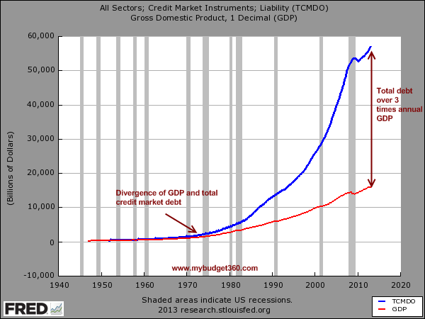
This is the answer. While incomes are stuck, debt has massively expanded. The total debt market is now over 3 times the size of our annual GDP. Since the crisis hit in 2007, households have been in a process of deleveraging but thanks to low rates, Wall Street and large financial institutions are back to speculating in the markets and injecting tons of digitally printed money back into the economy. Yet as we have seen with household income data, very little has trickled down to regular families and most of the gains remained at the top.
How much do Americans earn? The numbers are rather clear. The typical US household makes $50,500. With even our modest headline inflation number (of course the CPI understates other items like college debt and home prices) this is problematic because wages are simply not growing. The above income figures reflect a primary reason why most Americans don’t feel this as a recovery.

No comments:
Post a Comment